Theme Features
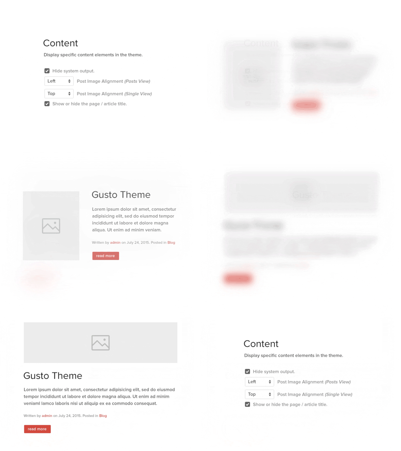
Gusto is featuring brand new and advanced Warp options.
Block Appearance
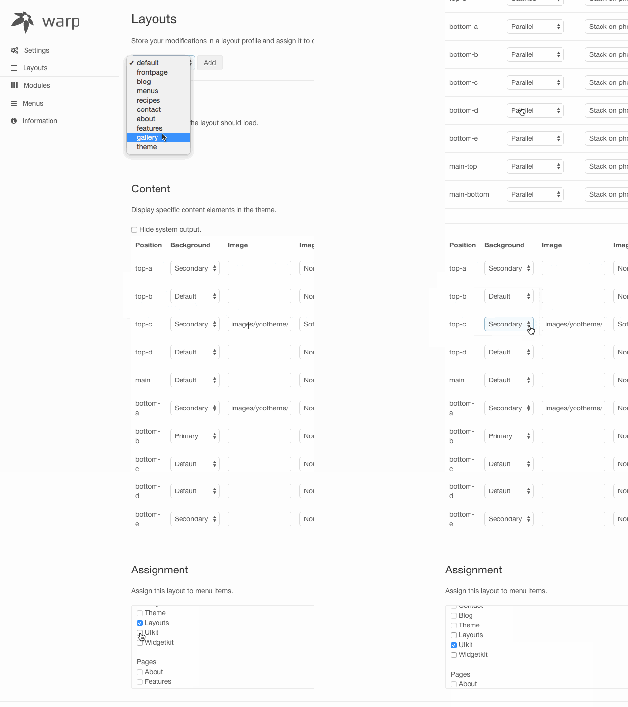
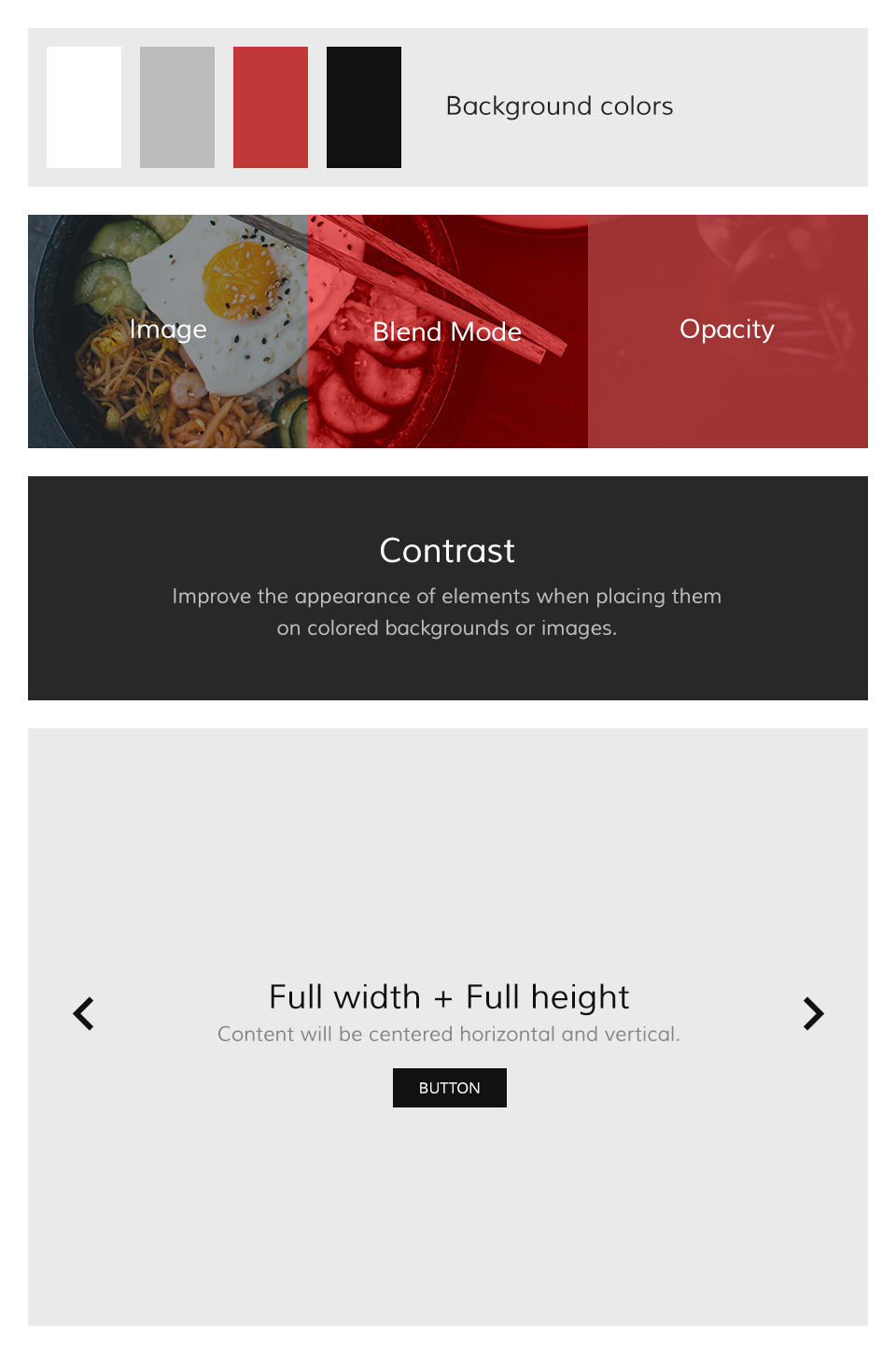
Gusto supports some useful options for all block layout positions. All settings can be combined for a block position. If you need different block settings for different pages, you can use layout profiles and assign them to your menu items.
Options
- Background - Select from 4 different background colors.
- Image - Add a path to your background image.
- Image Blend - Define how the background image will mix / blend with the background color.
- Image Opacity - Will add an overlay with the same background color of the block and an opacity value.
- White - Enables the Contrast component. Recommended for block positions with a primary background color or image.
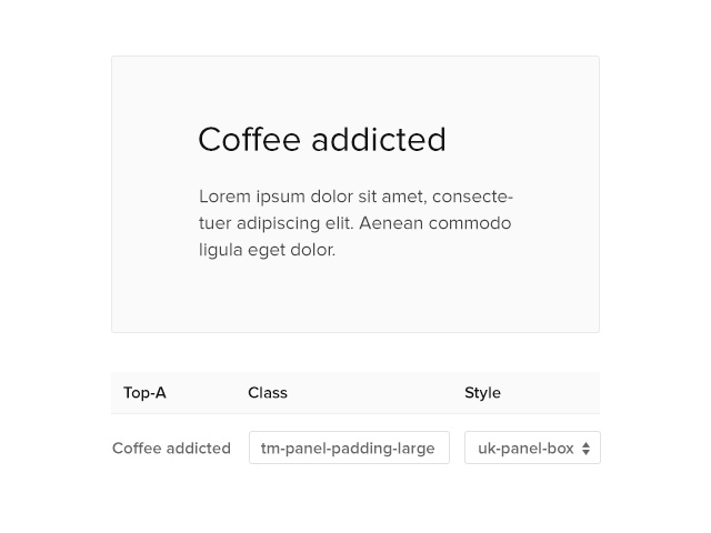
- Padding - Select the spacing between the content and its block container.
- Full Width - This will remove the constraint of the content container so it will extend to the full viewport width. Recommended for full width Widgetkit slideshows, for example.
- Full Height - The block will take up full viewport height. If the navbar is set to default, the navbar height will automatically be subtracted from the subsequent block.
- Grid Collapse - This option will reset the grid gutter and is recommended, if you want to use a full width Widgetkit slideshow or something similar.
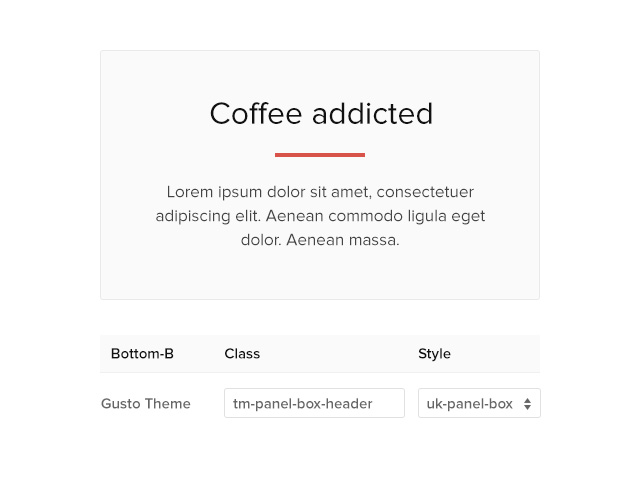
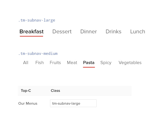
- Class - Use this input field for a custom CSS class which will be added to the block.
Navigation
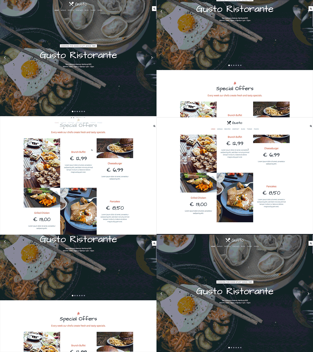
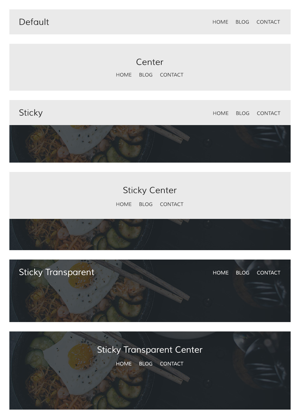
The main navigation of Gusto Theme supports the latest UIkit sticky navigation component features. You are able to select from 3 different navigation behaviors/styles and 2 layouts. The styles and the layout can be combined, this makes 6 different navigation combinations.
Navigation Styles
- Not Sticky - Default navigation.
- Always Sticky - Default navigation style but it will stick to the browser window when you scroll up and down.
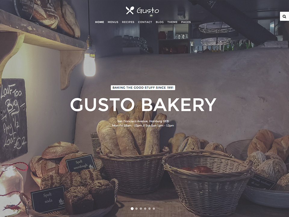
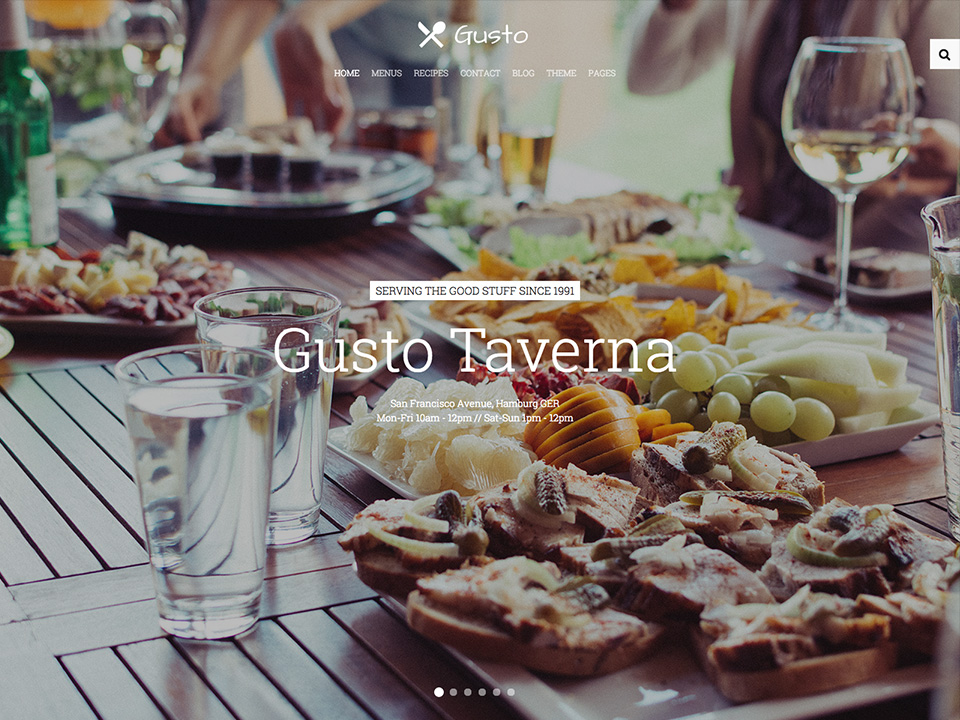
- Transparent and Sticky - Will start on a transparent background and overlays a block position with full-height property and switches back to the default sticky navigation style at a specific point.
Navigation Layouts
- Default - A condensed navbar with the logo on the left side and the menu items on the right side.
- Center - Logo and menu items are centered and stacked.
